
Practical session 3. Extra: Viz with ggplot2
31/01/2019
1 🔲 Always begin from the scratch
R allows to draw anything. Before writing a code, imagine in detail the graphics you want to create. You may even draw it by hand.
2 🙌 Decide on the kind of plot
Depends on a type of data and a purpose of communication.
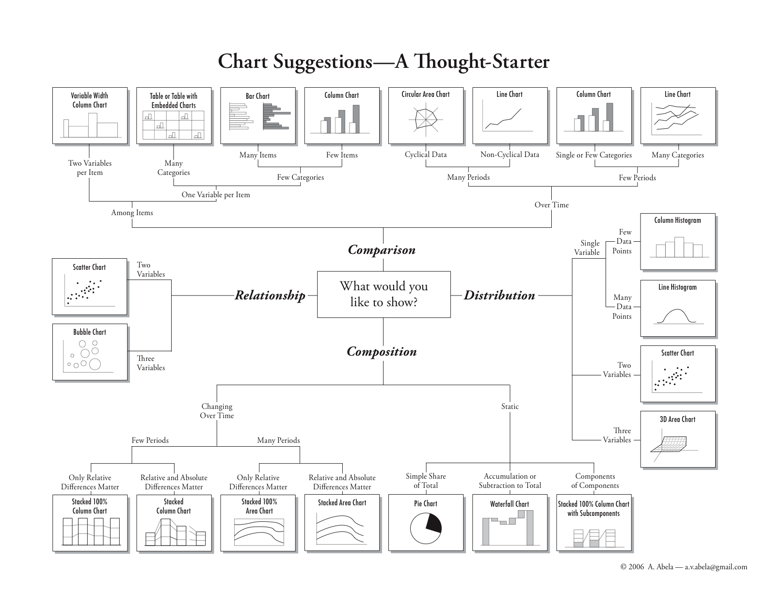 http://extremepresentation.typepad.com/files/choosing-a-good-chart-09.pdf
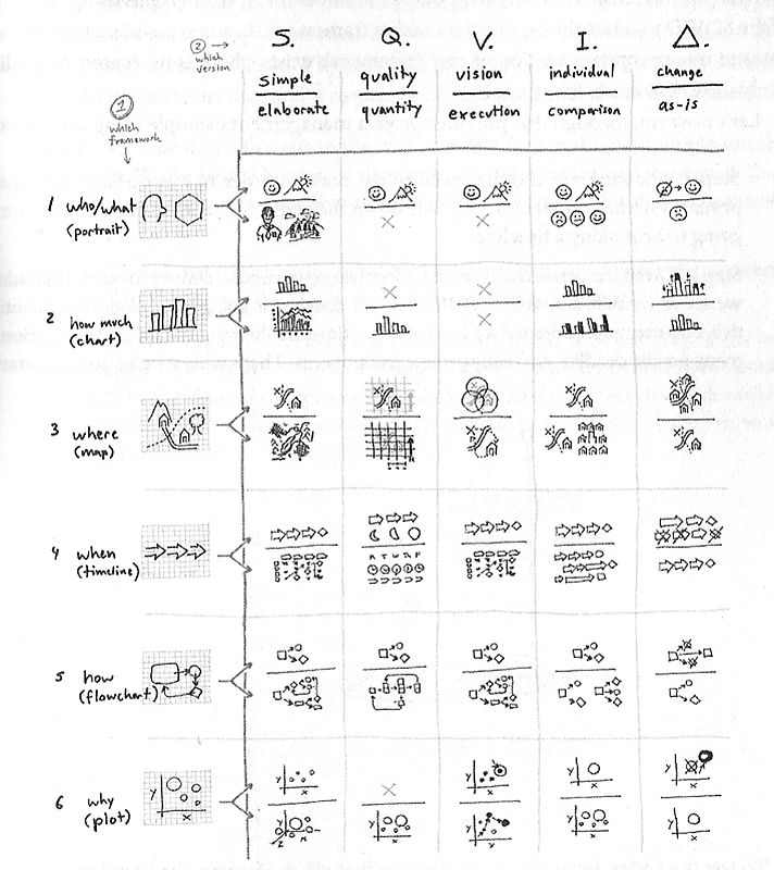
3 🌈 Means of expression
Kinds of graphs are just a combinations of different means of expression. Converting data to graph involves many decisions of how to map data to the visual elements. Do not let the software decide for you!
Means of expression:
- coordinates (two-domensional, geographic maps, spherical, circular, etc.),
- distances,
- shape of marker (circle, triangle, rectange, star, letter, etc.),
- size of marker (❗️eye can catch extreme sizes only),
- type of lines (solid, dashed, dotted),
- width of lines,
- colors (of lines, markers, fills, etc.)
- transparancy,
- digits and characters,
- text: legends (❗️avoid), axis labels, titles,
- text: annotations, footnotes.
❗️ Every mean of expression should be mapped to a single variable.
4 ggplot2
gg = Grammar of Graphics, based on a book by Leland Wilkinson https://link.springer.com/content/pdf/10.1007%2F0-387-28695-0.pdf
4.1 General structire of ggplot2 code
ggplot(data= some data.frame,
       mapping = aes( x     = variable on axis x,
                      y     = variable on axis y,
                      role1 = variable 3,
                      role2 = variable 4,
                      etc.)
                      )
        ) + # Required part. Note the + sign connecting the lines.


  geom_ХХХХХХ(   # instead of ХХХХХ write a desired kind of graphic, for example, point
  aes( data-dependent characteristics ),
      non-varying characteristics, for example, if all the points should be black, color = "black") +

  scale_GEOM FEATURE_SUB-FEATURE() + # construct or change the scales

  labs(title, caption, x, y) + # labels and titles

  theme() + #  Styles, backgrounds, other details.

  coord_flip() + facet_wrap(~ group)  # further manipulations
It is not required to include all the parts, there are nice defaults.
4.2 Step-by-step
Task: visualize link between age and life statisfaction accounting for gender and age.
4.2.1 1. Prepare the data
library("sjmisc")

d <- data.frame(
    life.satisfaction  = as.numeric(PT$stflife),
    age.sq = as.numeric(PT$agea^2),
    age = as.numeric(PT$agea),
    gender = to_label(PT$gndr),
    health = as.numeric(PT$health),

    stringsAsFactors = F
)
4.2.2 2. Create coordinates
library("ggplot2")

g <- # save to an object
ggplot(
   data = d,
   mapping =
     aes(  # aes stands for "aesthetics"
        x =      age,             # axis Х
        y =      life.satisfaction, # axis Y
        color =  gender,
        size  =  health)
     )

g # check what's in the object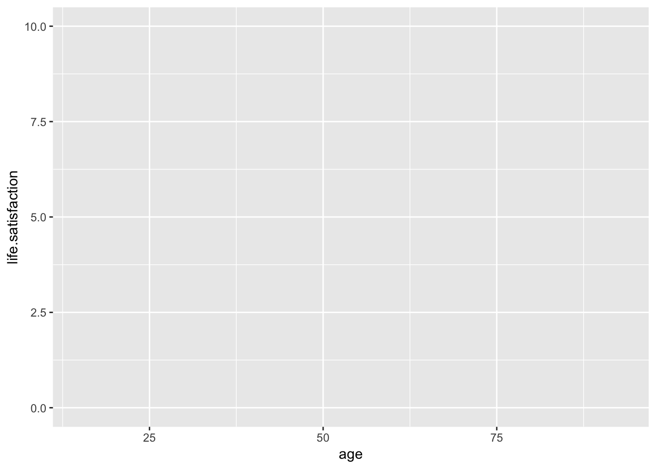
4.2.3 Step 2a. Add ‘geom’, i.e. shapes of the graphics
g <-
  g +                   # the object with coordinates
  geom_point()          # add points.

g  # show the appended plot.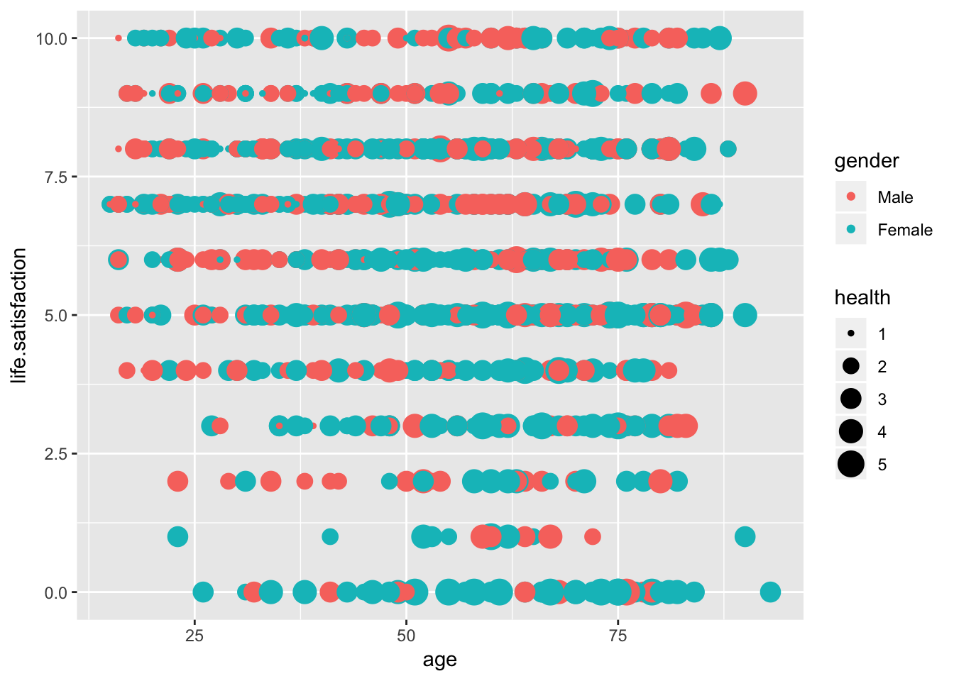
4.2.4 Step 2b. Add another ‘geom’
g <-
  g +
  geom_smooth(                # adds the regression line (curve) of x on y
              color = "blue", # needs to be fixed to a constant, otherwise there will be two lines for each color, i.e. gender
              size  = 1)          # needs to be fixed to a constant, otherwise there will be 5 lines for each size, i.e. health

g  # show the appended plot.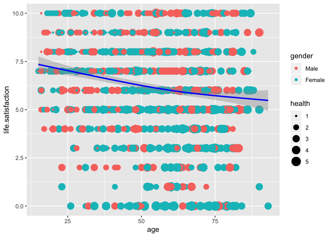
4.2.5 Step 3. Customize axes and legend
g <- g +

  scale_y_continuous(breaks= c(0, 1, 5, 9, 10)) + # ticks and labels on Y axis
  scale_color_manual(name="Gender", values= c("turquoise3", "orange"))+            # label of colored elements
  scale_size_continuous(name="Subjective health") # label of size elements

g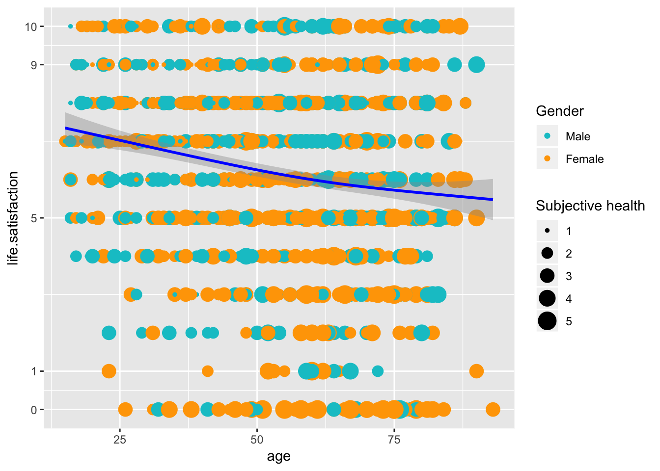
4.2.6 Step 5. Additional tuning
g <- g+

  geom_hline(yintercept = 6.2, color = "black", linetype = "dotted")+ # just horizontal line showing average life satisfaction

  # Labels
  labs(title = "Satisfaction and age",
       caption = "Based on ESS data",
       x = "Age (in years)",
       y = "Life satisfaction (11-point scale)")+

  # Style adjustments
  theme(  axis.line = element_line(colour = "black"),
          panel.grid = element_blank(),
          plot.caption = element_text(hjust=1),
          plot.title = element_text(size=16, family="Times"),
          panel.background = element_rect(fill="white")
        )

g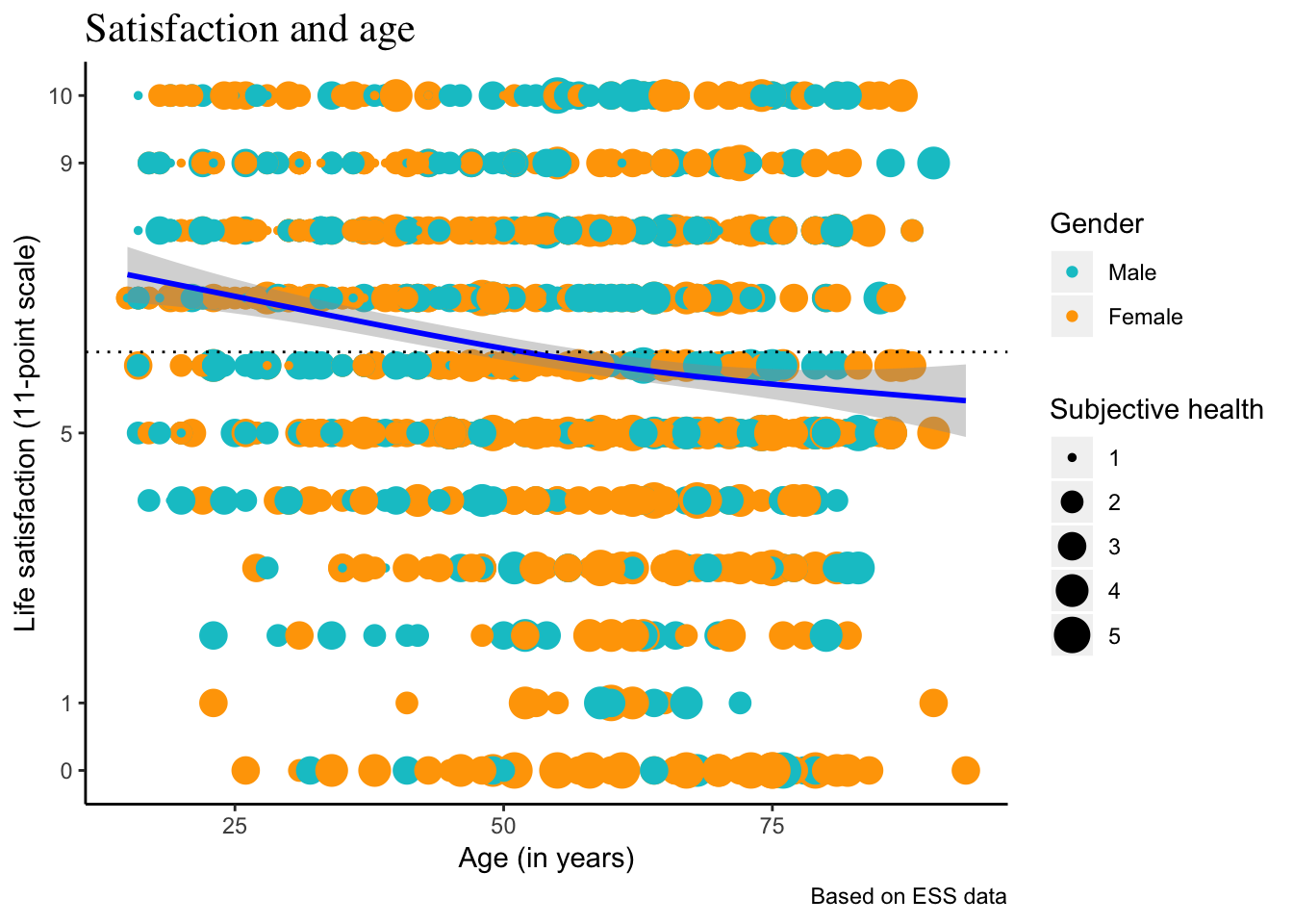
❗️ Usually, the ggplot code is a single piece, above steps are about how to write the code.
4.3 qplot()
Very quick way to plot (however, weakly customizable)
qplot( x      = age,
       y      = life.satisfaction,
       color  = gender,
       size   = health,
       geom   = "point",
       data   = d)
5 Try
Try to reproduce this graph with health as Y variable, life satisfaction as color, and gender as “shape” aesthetics.
5.1 See also
ggplot2: http://www.cookbook-r.com/Graphs/